Whenever you want to add an object to an image, you usually run into perspective problems. With the Vanishing Point filter, you can tell Photoshop what a correct perspective is for that specific photograph. Once defined, you can than add images, text, etc. to the image and it will automatically give you the correct perspective. In this course, we will show you how to use the Vanishing Point filter. We will take an apartment building and expand onto the building and we will add a sign to the side of the building. Finally, we will add text to the pavement.
Currently we are using Windows Vista Home Premium 64 Bit and the Photoshop CS4 Extended 64 Bit version.
Knowledge You Need to Know:
If you are unfamiliar with certain areas that are not covered in this tutorial, feel free check out the other tutorials on our website. We have many different types of tutorials that can be downloaded (Video, PDF) or viewed online that will train you for free! Once you have the knowledge, feel free to come back and go through this tutorial again.
Preparing For This Tutorial:
You will be using a picture of this apartment building. If you do not have this image, please scroll down to the image of “Click Picture To Download Supporting Files” and download the image. Please open the image PE-APARTMENTS in the Photoshop Program.
You will notice this Photoshop file has a few layers: “Sign”, “Apartment”, and “Background”. We did modify this image before we saved it as an example file. To see what the original looked like, turn off in the Layers palette the “Apartment” layer and turn on the “Background”. We edited (very quickly and not perfect) the left hand side of the apartment wall.
Vanishing Background:
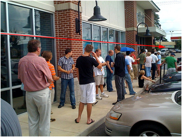
The first time we saw the Vanishing Point filter (Photoshop CS2), we went WOW, what a powerful tool, but it really only can be used for limited projects. We were right about the WOW factor, but we were wrong about the limited uses. Picture a group of people standing on a sidewalk. The people standing closer to the camera will appear larger and the people farther away will appear smaller. See example below.
If you wanted to copy a new person standing in this picture, you would normally have to guess the correct size the person would be based on how far away from the camera you placed them. As long as you have some sort of perspective reference (the building in this case), you can use the Vanishing Point filter to take the guess work out of the equation.
Basics Of The Vanishing Point Filter:
**Make sure the Apartment layer is selected. Left click the “Filter” menu and move the mouse down to the “Vanishing Point…” and Left click this command.

Let’s go over the first 4 tools on the left hand side.
| A). We will be using this tool to create a new plane to tell Photoshop the perspective. Photoshop Tip – Use the “C” key on the keyboard to automatically to select the “Create Plane Tool”. | |
| B). Eyedropper to select a specific color. | |
| C). The Move tool will allow you to move the plane. | |
| D). Magnifying Glass to zoom in and zoom out. Photoshop Tip – You can always use the keyboard shortcut of CTRL-“+” (Zoom in) or CTRL-“-“ (Zoom out). |

Zoom in until you see most of the main building. Make sure your “Create Plane Tool” is selected. Left click on the corner on the left hand side and Left click the second point (top right hand side of building).
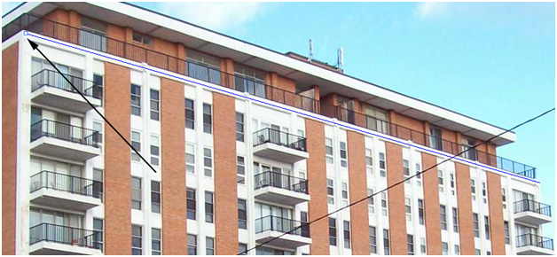
Now Left click the bottom right hand side and finally the bottom left hand side of the building. If you did it correctly, you should see a blue grid.

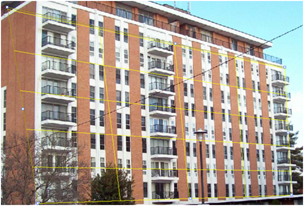
What if you see a yellow grid, like the one below? That tells you that it is mathematically impossible for that perspective, but you are very close to a perspective that will work. You can technically use a Yellow grid, but trust us, stick with the only blue planes, to make it look perfect.
Oh the deadly red plane. This means it is mathematically impossible for that perspective, and it will NOT allow you to use it. You will need to adjust the points to fix the perspective.

If you want to adjust the point, Left click and HOLD down the mouse button and drag the point. Release the Left mouse button when you are happy with the changes.

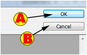
One of the nice features of the Vanishing Point Tool is that it remembers your planes. For this example, Left click on the “OK” button, which is located on the top right hand side of the window.
| A). Left click to apply the changes or the planes. | |
| B). If you want to disregard your changes, Left click the “Cancel” button. |
Now get back into the Vanishing Point filter and you will notice that it saved your 1 plane.
Our goal is to extend onto the building to the right hand side. Left click the center right point and HOLD down the Left mouse button and drag it to the other building. Release the Left mouse button when you are right next to the other building.
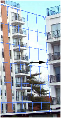
You will notice a new option will be displayed. This option allows you to change the size of the boxes. Either Left click the text box and change the value or Left click the down arrow. Move the mouse pointer to the up carrot and HOLD down the Left mouse button and drag it left or right (decrease or increase). Release the Left mouse button when you are happy with the grid size. Photoshop Tip – You can also change the grid size by moving your mouse pointer to the word “Grid Size” and holding down the Left mouse button and dragging the mouse left or right. When you are happy with the grid size, release the Left mouse button.
For our example, we changed the grid size to 50.95.

Now that you have created a plane, a few more tools are available.
| A). Use this tool to edit a plane (edit points). **For this tutorial, use this tool to move the top center point up to the top of the ledge of the building** | |
| B). The Marquee Selection tool allows you to make a selection. | |
| C). The Stamp tool will allow you to duplicate portions of the image. |
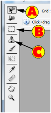
Now you will see we moved the top middle point up to the top of the ledge.

You will notice the Marquee Selection tool and the Stamp tool will resize based on the perspective. This means, that if the object is farther away, the Stamp tool will actually become smaller in size.
Use the Magnifying Glass tool, zoom into the right side of the building. Now using the Marquee tool, begin the selection to the right of the brick at the top of the apartment and HOLD down the Left mouse button and move the mouse pointer to the bottom right of the plane. Release the Left mouse button.

When you are using the selection tool, there are 3 important options in the menu.
| A). Left click the drop down box or Left click the numeric box and enter a Feather value. A Feather value is how far beyond the selection you want to blur and select. | |
| B). Want to bleed through to the layer below? Reduce the Opacity to less than 100 to begin to see the layer below. Left click either the drop down box to change the value or Left click the text box and enter a value. | |
| C). The Heal option is either Off or On. When turned on, it will try blend the pixels together. The last value is the Luminance value, which will blend the light of the color together. Left click the drop down box to select a specific heal type. |
**For this tutorial, leave the Feather at 1 and Opacity as 100 and the Heal should be Off.

Onto the magic! If you wanted this image to look perfect, you would clone closer to the edge of the building to sample (start with the 2nd cement column from the right side). If you want to do this quick, sample to the right of the center balcony cement column. For this tutorial, we will be doing the quick version.
Left click the Stamp tool within the Vanishing Point filter.
| A). This changes the size of the brush. Left click the text box and enter a numeric value or Left click the drop down box to select the Diameter size. | |
| B). The Hardness is how blurred (soft) the edges of the Cloning Stamp tool will be. 100 will be the hardest edge. Left click the drop down box and select the Hardness level or Left click the text box and enter a value for the Hardness. | |
| C). The Opacity will allow you to bleed through to the layer below. Left click the text box to enter a value or Left click the drop down arrow and select the Opacity level. | |
| D). The Heal option when turned on will blend the source and target area together. If a Luminance option is selected, it will blend the light between the source and the target. If you leave the option off, than it will not Heal anything. Left click the drop down box and select the Heal type. |

For this tutorial, change the Diameter to 81, Hardness to 100, Opacity to 100 and Heal to Off.
Now you need to select the source area. We are doing the quick version, so we will be hold down the ALT key and Left click to the right of the cement column of the center balcony at the top of the ledge. Now release the ALT key on the keyboard.
Photoshop will not allow you to select the source outside a plane. Once selected you will see a green + sign on the sample source location.

As we said before, we wanted to do this quick, which means it cloned the line in and duplicated the light pole. If you wanted to make this perfect, clone right up to that line or manually clone out the wire after you apply the changes. Either way, we have added to the building and it kept the perspective perfect. Notice how the cement columns look smaller towards the new edge of the building (farther away from the camera).

Pasting Images Onto A Plane:
Our goal is to add a plane to the left side of the apartment building. Because we already have one plane, let’s use that perspective and add a new plane to the left hand side of the building. HOLD down the CTRL key and HOLD down the Left mouse button on the center left point of the first plane and drag it to the left hand side of the building. Release the CTRL key and Left mouse button to add the new plane.

Use the Edit Plane tool to change the perspective so it matches the left hand side of the building better. Here is our plane. As you can see it stops on the corner of the building.
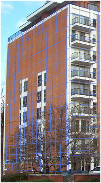
The next few steps can get a little confusing. With the “Apartment” layer selected, Left click the new layer button.
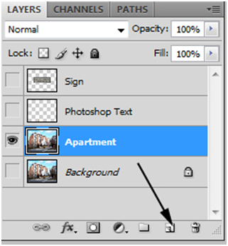
Feel free to rename the layer if you would like. Left click the “Sign” layer and make sure the layer is selected. Left click the Eye image to unhide that layer. HOLD down the CTRL key and Left click on the image to the left of the word “Sign”. Release the CTRL key and you will notice that the sign will be selected.
Use CTRL-“C” to copy the sign. **Now hide the layer, using the eye image. Left click the “Sign Building” layer to make that active again.
Use CTRL-“D” to Deselect.

Get back into the Vanishing Point filter and use CTRL-“V” to paste the image. Move the mouse pointer to inside the image and HOLD down the Left mouse button and drag it so it fits on the corner of the building.
Yes, the sign is rather large (we will be fixing that shortly), but notice what it did to the sign. It bent it around the corner to keep the correct perspective.
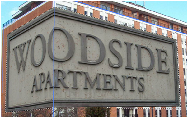
Let’s resize that sign. Left click the Transform tool or use the “T” key as a keyboard shortcut.

You will notice points around the object. Move the mouse pointer to one of the corner points. HOLD down the Left mouse button on a point and HOLD down the Shift key and begin to resize the image by moving the mouse pointer. Release the Left mouse button and the Shift key.
If you move the mouse pointer outside the pasted object, you can get the double curved arrow. If you HOLD down the mouse button and drag, it will begin to rotate. Release the Left mouse button when you are happy with the rotation.
If you move the mouse pointer inside the pasted image and you HOLD down the Left mouse button and drag, it will move the image. Release the Left mouse button when you are happy with the changes. 
To make it look better, change the opacity of the “Sign Building” layer to 50%. Here is how ours look.
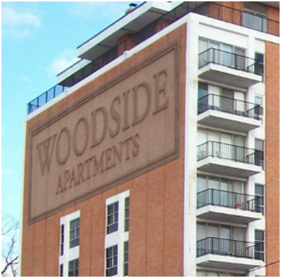
Text:
To allow text to follow along a perspective, use the same steps on how to add an image.
Create the text (make sure you select your color and we used color a39763 and we used Arial font). On the text layer, CTRL Left click the “T” and use CTRL-“C” to copy. Now hide the text layer and use CTRL-“D” to deselect. Now create a new layer (we called ours Road Text). Make sure that new layer is selected and get into the Vanishing Point filter.
Here is how our Layer palette looks now.
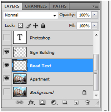
Use the Create Plane tool and create a new plane on the road. Use the curb as your perspective guide.

Use CTRL-“V” to paste and resize and move the text to the plane on the road. We changed the “Road Text” layer in the Layers palette to 60% opacity.

One of the tools we did not cover is the Ruler tool in the Vanishing Point filter. We rarely use this tool, but if you want to use it, Left click the tool and move the ruler to your starting point and HOLD down the mouse button and drag it in a direction. Release the Left mouse button and it will display the measurement.
The other tool, is the Brush tool. You can use this tool to brush on a specific color.
Before And After:
Here are the before and after images.
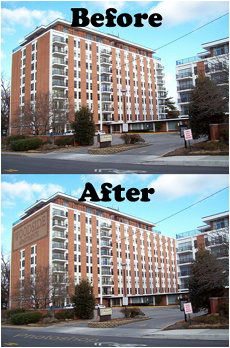
Additional Tips And Tricks:
Want to delete the plane. Use the Backspace key! Want to create impossible buildings? For this example, take the center point in the front of the building and HOLD down the Left mouse button and drag it up. It will create a perspective that makes it appear if cloned that the building is coming forward in that section.
Conclusion:
By now you should know the basics of the Vanishing Point Filter. You have learned how to clone objects, make selections, and even use the magnifying glass. Remember, if you have a plane that is red color, that means it is mathematically impossible. Stick with a blue plane and it will usually look perfect. Remember, you do not need to work strictly on buildings. Anything that has an existing perspective such as a room, semi-truck, desk, road, etc. will work.

1). What is the keyboard shortcut to use the Create Plane tool in the Vanishing Point filter?
| A). CTRL-“C”. | |
| B). “P”. | |
| C). “T”. | |
| D). “C”. |
2). What sub-menu of the Filter menu is the Vanishing Point filter in?
| A). It is located in the Other sub-menu. | |
| B). It is located in the Perspective sub-menu. | |
| C). It is not in any sub-menu and is located inside the filter menu. | |
| D). It is located in the Warp sub-menu. |
3). What does a blue colored grid in the Vanishing Point filter do?
| A). It means that it is mathematically impossible for that perspective, but that you are very close to a good perspective. | |
| B). It means that it is mathematically impossible for that perspective and will not allow you to use that plane. | |
| C). It means that the perspective is perfect. | |
| D). It means that the length of the perspective is correct, but the height is wrong. |
4). Name the 3 options located in the Heal options bar in the Vanishing Point filter?
| A). On, Off, Luminance. | |
| B). On, Off, Light. | |
| C). On, Off, Dark. | |
| D). On, Luminance, Light. |
5). What is the keyboard shortcut to the Transform tool in the Vanishing Point filter?
| A). “R”. | |
| B). “T”. | |
| C). “C”. | |
| D). “D”. |
6). What happens to the Stamp tool when you move it up and down the perspective plane in the Vanishing Point filter?
| A).You will notice that it the size of the brush will always stay the same. | |
| B). The color of the brush will change to red if it can’t clone a specific area because the perspective is wrong. | |
| C). You will notice that the farther away from the source that it will not clone any longer. | |
| D). You will notice that the farther away from the source the brush size will resize. |
7). To expand onto an existing plane and change the perspective angle, what key on the keyboard do you hold down when using the Vanishing Point filter?
| A). “Shift”. | |
| B). CTRL. | |
| C). ALT. | |
| D). Fn. |
8). When using the Transform tool in the Vanishing Point filter, how do you resize the object?
| A). Find any of the points and HOLD down the Left mouse button and drag. | |
| B). Right click the image and Left click “Image Size” to set the size. | |
| C). Drag the image to the “Resizing” button in the Vanishing Point filter. | |
| D). Move the mouse pointer to the center point and drag it to the right to reduce the size of the object. |
9). How do you extend onto a plane in the Vanishing Point filter?
| A). Move to the point and HOLD down the Left mouse button and drag the mouse outside the exiting plane. | |
| B). Right click the plane and Left click the “Resize” command. | |
| C). Delete the plane and draw a new plane and that is the only way to resize. | |
| D). Apply the plane by Left clicking the “OK” button and then use the Transform tool to adjust the plane size. |
10). What is one way to change the Grid Size in the Vanishing Point filter?
| A). Move the mouse pointer to the text box and then HOLD down the Left mouse button and drag it left or right. | |
| B).Right click the “Grid” field and Left click the “Resize” command from the menu. | |
| C). Inside the plane HOLD down the Left mouse button and drag the mouse up or down. | |
| D). Move the mouse pointer over the Grid Size label (text) and HOLD down the Left mouse button and drag it left or right. |
Answers: 1). D, 2). C, 3). C, 4). A, 5). B, 6). D, 7). B, 8). A, 9). A, 10). D
Scoring:
0 - 5 = Please review the video tutorial and re-read this document either offline (PDF) or online.
6 – 8 = We would recommend that you print this document off and read it at a later time.
9 – 10 = Congratulations you have passed the quiz. Go ahead and view another tutorial on our site.
We hope you enjoyed this detailed tutorial. Please visit us at: http://www.Photoshopeducation.blogspot.com to expand your knowledge within Adobe Photoshop.

Click Picture To Download Video File To View Offline
Download Total Video Player, iTinySoft

Click Picture To Download PDF Tutorial
Download Adobe Reader, Adobe Corporation
Click Picture To Download Supporting Files
(Brushes, Textures, Fonts, Images, Actions, .PSD, Etc.)
Download ZipGenius Standard Edition 6.0.3.1150, Dicono di ZipGenius


great....
ReplyDeletei found a fantastic Website for really cool Photoshop Tutorials
http://www.tutorials99.com
where all tutorials are Professional and Higher Page Rank